
Zestee
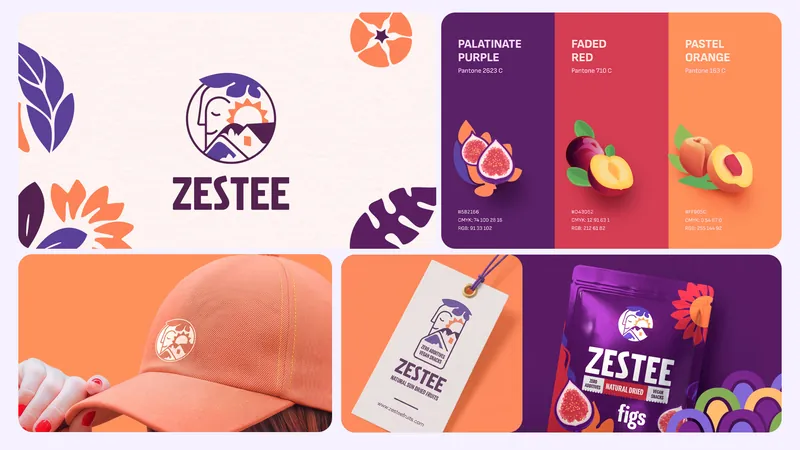
We built Zestee from the ground up — shaping its brand identity, packaging and digital experience around one clear ambition: to make healthy snacking feel more joyful. Mediterranean warmth, bold visual energy and a playful point of view come together to give the brand a distinctive presence across every touchpoint.
The Challenge
Healthy snacking has a communication problem: it often feels overly functional, clinical or predictable.
Zestee needed to enter the category with a stronger personality — making better-for-you choices feel exciting, accessible and full of life.
A Little More Zest
We built the brand around a simple shift: Healthy can have a personality.
Rather than leaning into the familiar language of wellness, we gave Zestee a brighter, more expressive world — rooted in Mediterranean energy and everyday optimism.
Personality, Packaged
Bold typography, vibrant colour and playful graphic elements come together to create a visual language that feels instantly recognisable. Every element works as part of one system, giving the brand enough character to stand out while keeping the experience clear and approachable.
Designed To Stand Out
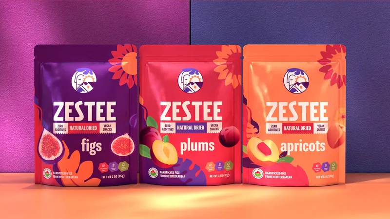
Packaging became the strongest expression of the brand. We designed each pack to feel energetic and distinctive on shelf, using colour, composition and graphic details to create a system that is easy to navigate but hard to overlook.
A World With Room To Play
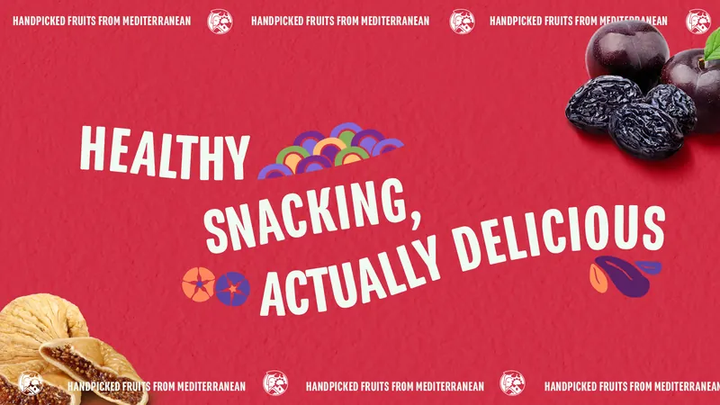
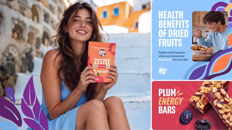
The graphic system gives Zestee room to move. Illustration, typography, colour and composition can shift across products and formats while maintaining a consistent sense of personality.
More Than A Pack
The idea extends beyond the product itself. Every touchpoint carries the same optimistic attitude, creating a brand world that feels cohesive across communication, digital and physical experiences.
Made To Be Remembered
Zestee turns healthy snacking into something more expressive, colourful and inviting. A brand built not around what it needs to be — but around how it wants to make people feel.