Vesium
From Technical To Distinctive
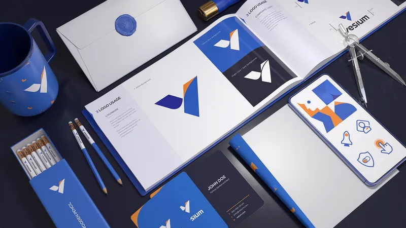
We reshaped Vesium’s identity to give a technical business a clearer, more confident presence. The new system brings structure, character and a sharper visual point of view to a complex technology landscape.

Clarity, With Character
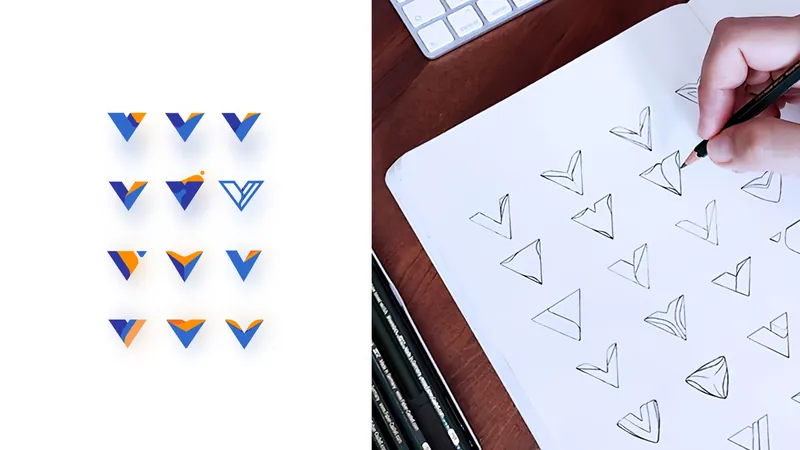
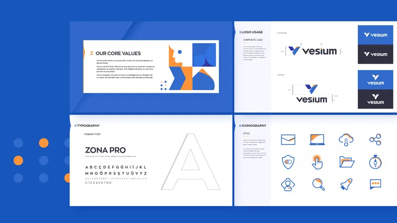
Rather than following the familiar codes of enterprise tech, we built a more distinctive visual language — balancing precision with personality. Every element was designed to make the brand feel current, capable and easy to recognise.
Built For The Digital World
We carried the new identity into a digital experience designed around clarity. A structured layout, focused hierarchy and purposeful interactions make a complex offer easier to understand and navigate.
One Brand, Clearer Presence
Identity and web were developed as one connected system. The result is a more cohesive Vesium — sharper in expression, clearer in communication and ready for its next chapter.