Troya
Making Craft Feel Contemporary
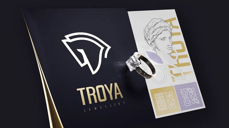
We shaped Troya’s identity around a more refined idea of luxury — one grounded in craft, precision and restraint. Rather than relying on the expected codes of jewellery branding, we created a visual presence with its own point of view: quiet, assured and distinctly contemporary.

The Power Of Less
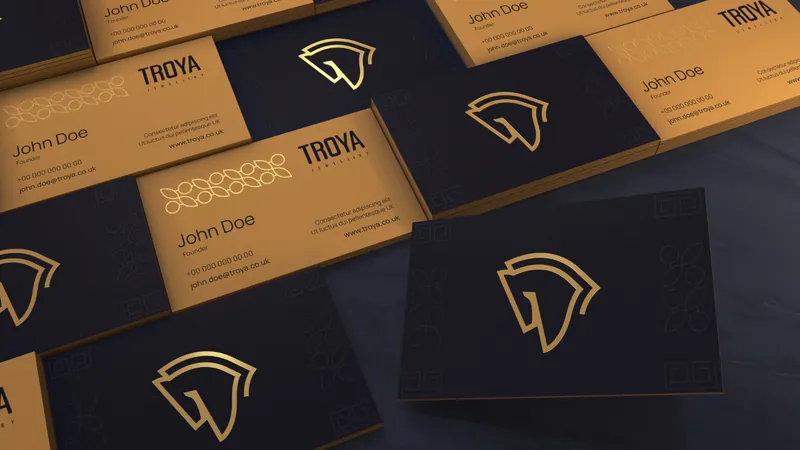
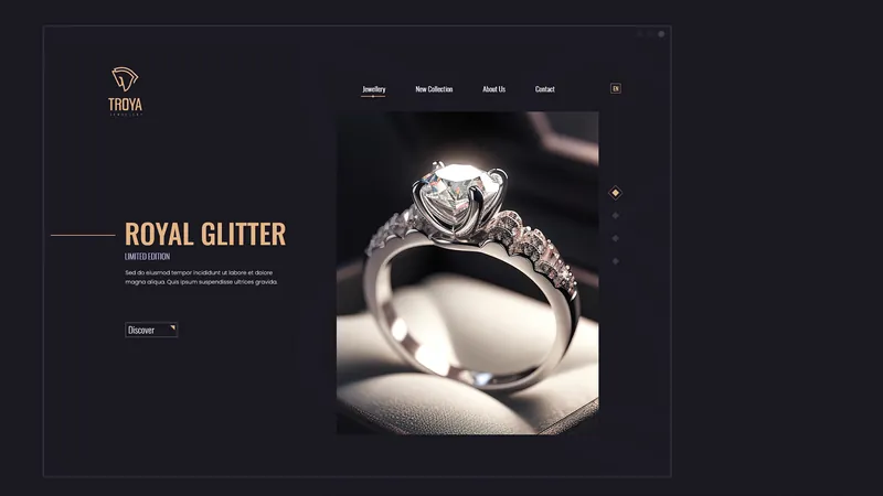
The identity is deliberately economical. Typography, proportion, space and imagery work together to create a sense of confidence without excess — allowing the quality behind the brand to remain the focus.
A Signature In Every Detail
We developed a visual language where small decisions carry weight. From typographic details to composition and image direction, every element contributes to a more elevated and recognisable brand presence.
Beyond The Jewellery Box
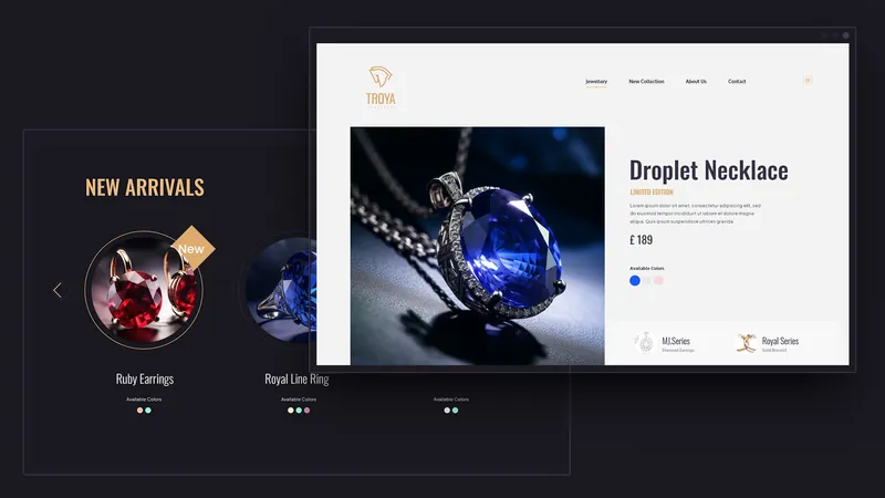
The system was designed to move naturally across the brand’s different expressions. Packaging, communication and digital applications share the same visual logic, creating consistency without making every touchpoint feel identical.
Quiet Luxury, Clearly Defined
A brand identity built with restraint rather than decoration. A sharper visual position for a jewellery business where craftsmanship is the product — and the brand knows how to let it speak.