Stoneline
Where Material Meets Meaning
We shaped Stoneline’s visual identity around a simple idea: when the product has this much character, the brand should know when to step back — and when to make a statement. A refined visual system gives the brand a stronger point of view, balancing the timeless quality of natural materials with a more contemporary expression.
A Language Of Texture
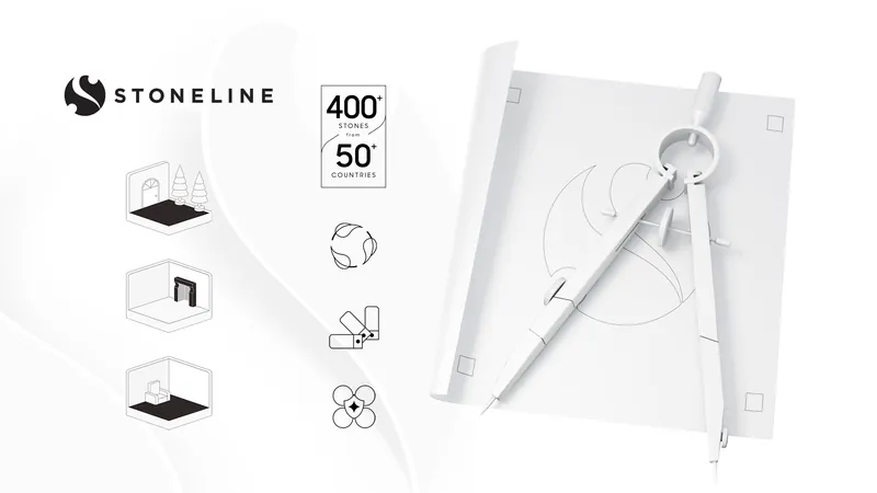
We built a visual language that lets material, colour and composition do the talking. Typography, spacing and imagery work together with a quieter confidence — creating a premium aesthetic without falling into the usual language of luxury.
Designed To Let The Work Shine
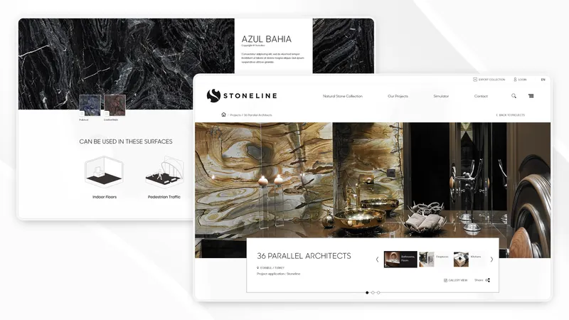
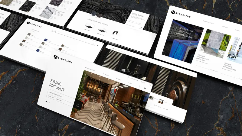
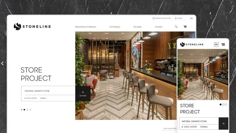
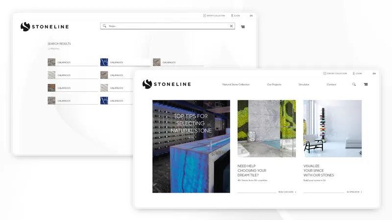
The website was designed as an experience, not simply a catalogue. We created a clearer structure for navigating collections, discovering materials and understanding the details behind them — while giving imagery the space it deserves.
Complexity, Edited
With a broad product range and multiple layers of information, clarity became part of the design. We simplified the journey, strengthened hierarchy and created a more intuitive way to move between inspiration, products and technical content.
A System With Room To Breathe
The identity and website were developed as one visual system. Every detail — from typography and composition to interaction and content structure — works towards the same goal: a brand experience that feels considered, distinctive and built around the material itself.