Romano
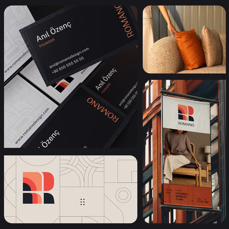
A Brand Built Around Form
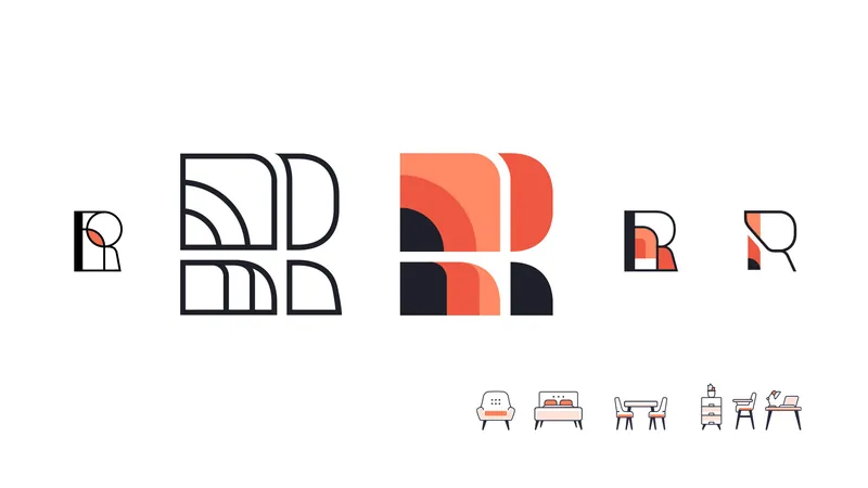
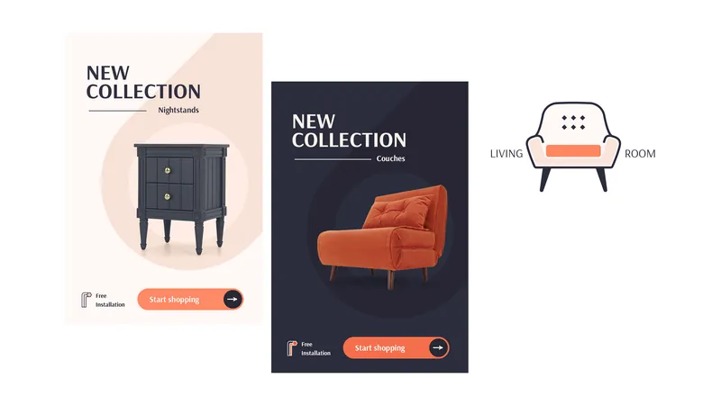
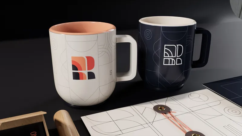
We reshaped Romano’s identity around the character of the objects themselves — creating a visual language with more clarity, confidence and distinction. The new system gives the brand a stronger point of view while keeping the focus where it belongs: on form, material and detail.
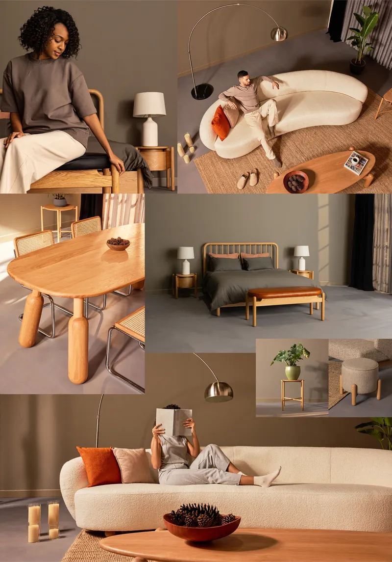
The Brand, In Frame
We developed the visual direction alongside the identity, shaping how Romano’s products would be seen, not simply how they would be presented. From composition and lighting to texture and detail, the photography creates a consistent visual world that makes the products feel considered, tactile and desirable.
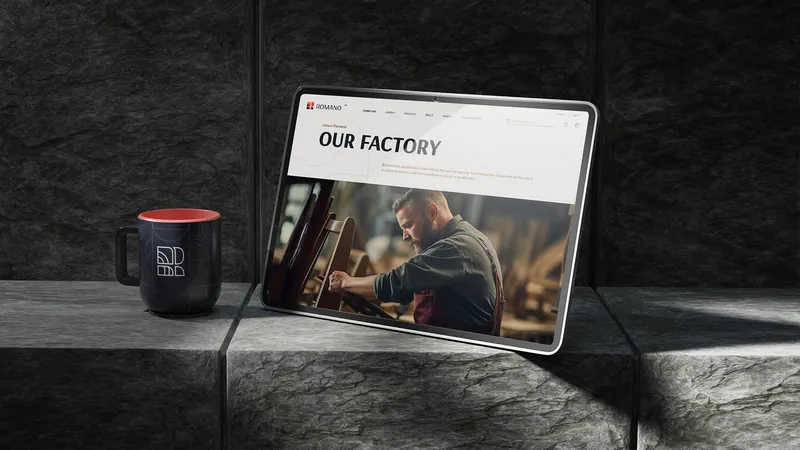
More Than A Product Catalogue
The website was designed to turn a large product range into a more engaging digital experience. Clear navigation, stronger hierarchy and immersive product presentation make it easier to explore the collection while allowing the visual identity to lead the experience.
A Moving Image Of The Brand
We extended the identity into motion with a brand film designed to capture the atmosphere behind the products. Rather than simply documenting the collection, the film brings together space, material, light and movement to create a more emotional expression of the brand.
One Visual Language
Identity, web design, photography and film were developed as one connected creative direction. The result is not just a refreshed brand, but a complete visual ecosystem — consistent across every frame, screen and physical expression.