
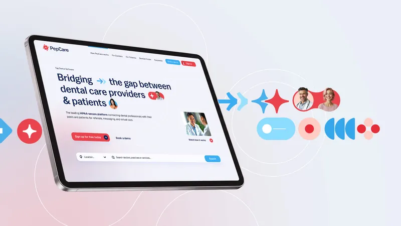
Pepcare
Brand identity and web design for Central America's fastest-growing dental referral platform. We emphasized the human aspect of the application by crafting a playful visual system we named "Connection-in-Motion," putting people front and center. The result was a joyful referral portal and doctor search engine with a soul.
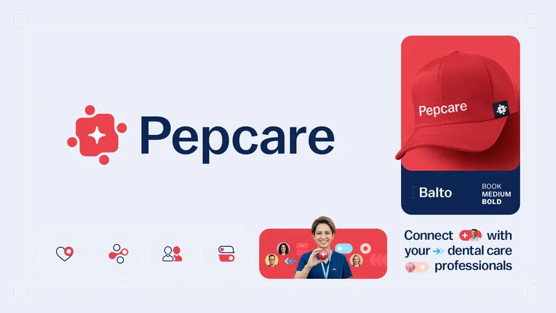
Visual idea
We built the identity around one simple thought: Connection is everything. Pepcare connects people with the right dental care, so we turned connection itself into the visual language.
Connection In Motion
A flexible system of moving forms creates moments of interaction, connection and energy. Not decoration. A visual idea with a job to do.
People, Not Procedures
Dental care is often communicated through procedures, technology and clinical language. We shifted the focus back to people. More warmth. More personality. Less distance.
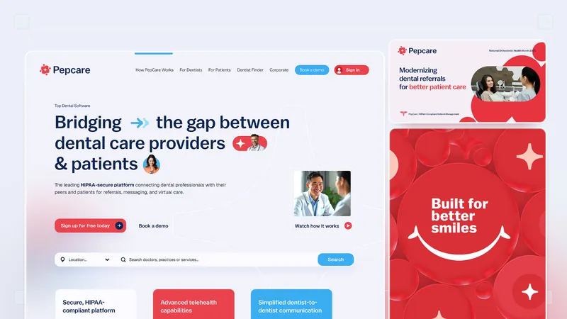
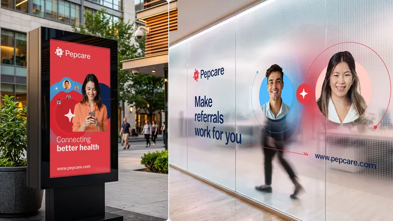
Identity
A bold colour palette, expressive typography and a flexible graphic system give Pepcare a distinctive voice across every touchpoint. Built to feel consistent without ever feeling static.
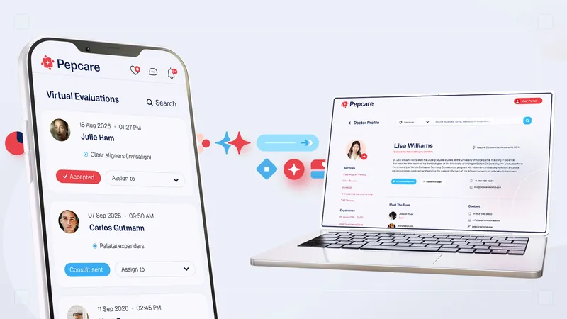
From Brand To Product
The identity naturally extends into the digital experience.
Every interaction carries the same principles: clear, approachable and unmistakably Pepcare.
Built To Connect
A brand system designed to grow with the platform — from its first interaction to every connection that follows.