
Le Marché
Rewriting The Rules Of Luxury
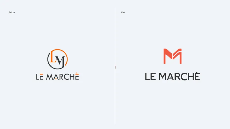
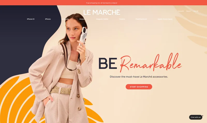
We refreshed Le Marché with a more contemporary take on luxury — less formal, more confident and considerably more alive. The identity keeps the sense of refinement, but removes the distance. The result is a brand that feels premium without taking itself too seriously.
When Polish Meets Personality
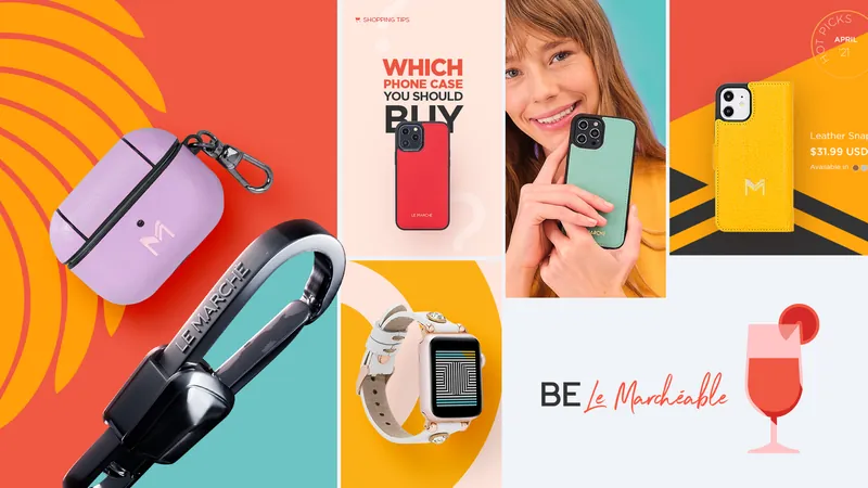
We introduced a sharper balance between elegance and energy. Typography, colour, composition and imagery were brought together with a lighter touch, creating a visual direction that feels younger without becoming disposable.
The Product Takes The Stage
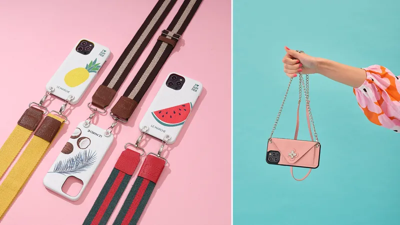
The brand was designed around the objects themselves. We created a visual approach that gives products presence while using composition and negative space to make the overall experience feel editorial rather than purely commercial.
A Different Kind Of Storefront
We translated the refreshed identity into a digital storefront with a stronger sense of pace and personality. The experience gives products room to lead while keeping browsing intuitive, content clear and the overall journey distinctly Le Marché.
Luxury, With The Volume Turned Down
The identity and website were developed as one creative direction. A more balanced expression of luxury — contemporary enough to feel relevant, distinctive enough to feel owned, and restrained enough to let the product do the talking.