
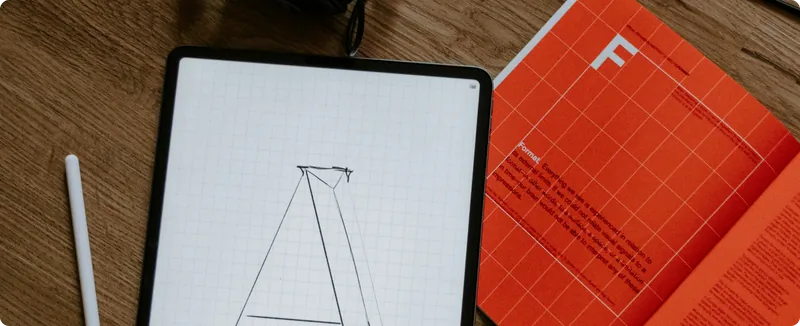
Why do so many brands look the same?
On sameness, safe choices, and the visual language of today.
Walk through almost any industry today and you’ll notice the same thing: different brands, remarkably similar faces. The same sans-serif type. The same restrained colour palette. The same carefully spaced layouts. The same promise of being simple, human and innovative. It’s easy to blame designers for this. But the problem is bigger than design. Brands are operating in an environment where being different can feel risky. Familiar patterns are easier to approve, easier to benchmark and easier to explain internally. A brand that looks “right” can pass through a room of stakeholders without creating too much friction.
The problem is that looking right and being recognisable are not the same thing. Research from the Ehrenberg-Bass Institute has long focused on what it calls distinctive brand assets: colours, shapes, typography, characters, sounds and other elements that can trigger recognition without relying on the brand name itself.
The important part is not simply having these elements, but making them distinctive and consistent enough to become associated with one brand.
That changes the question;
Instead of asking, “Does this look good?” we should also ask: “Could this belong to anyone else?”
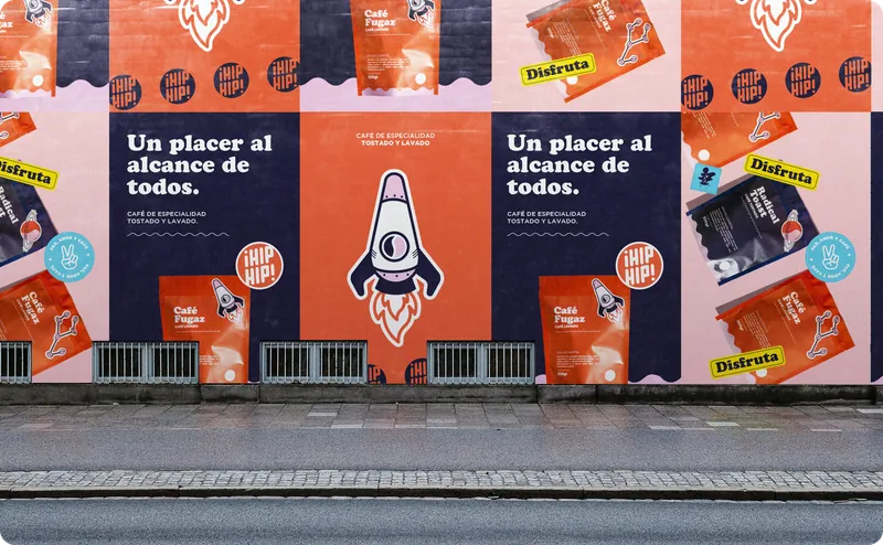
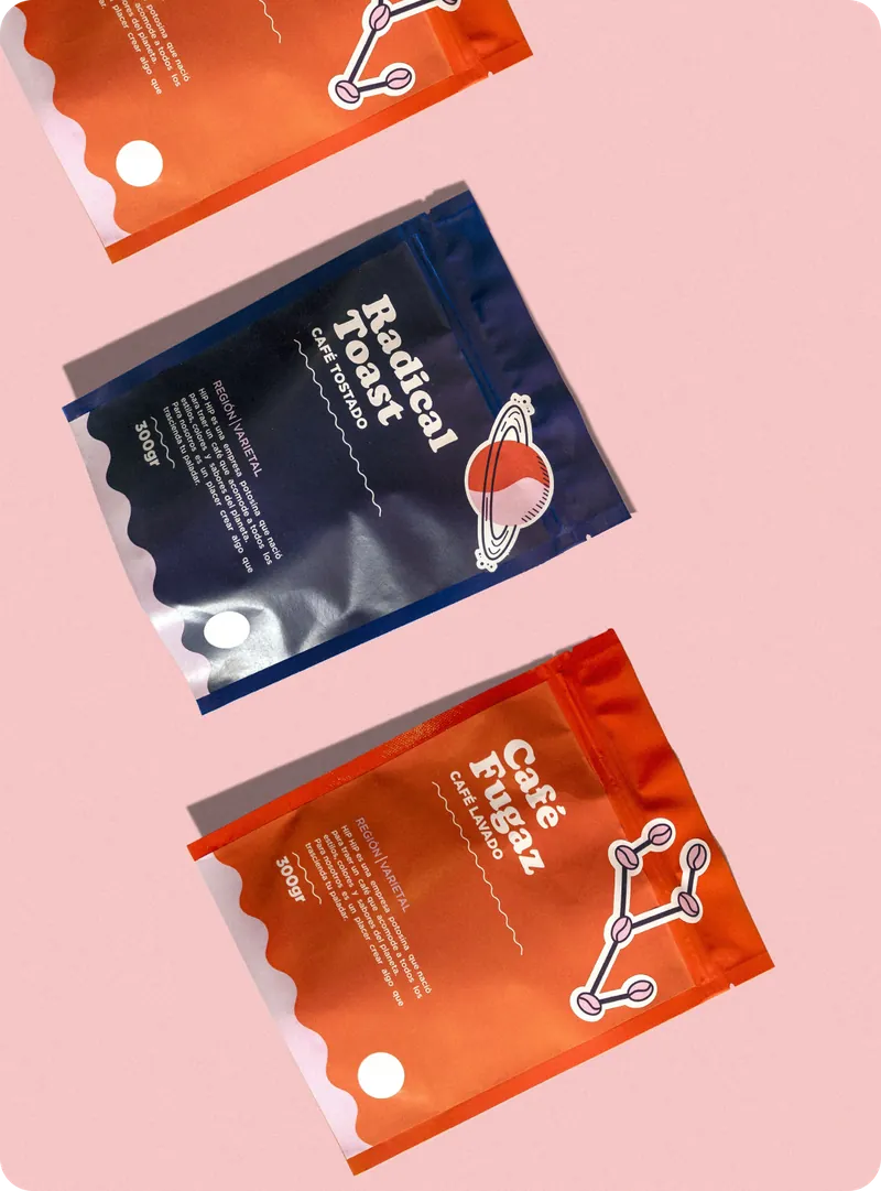
A visual identity does not become powerful because every individual decision is beautiful. It becomes powerful when those decisions start to behave like a language of their own. That might mean an unexpected typeface. A particular colour combination. A strange image treatment. A distinctive motion principle. A graphic device that becomes recognisable long before the logo appears. None of these choices need to be loud.
They just need to be ownable. The goal of a brand is not to win a beauty contest between other brands. It is to create memory. And sometimes the safest design decision is the least safe decision for the brand itself. Because when everyone is trying to look contemporary, contemporary starts to look like everyone else.
The challenge for us as designers is not simply to make brands look better. It is to make them easier to recognise, harder to confuse and impossible to mistake for someone else.